Client project · 2023
Smokin Grill —
Food ordering
app design
Designing a frictionless mobile ordering experience for a real local restaurant — from UX research through to final UI, grounded in what users actually need.
Designing a frictionless mobile ordering experience for a real local restaurant — from UX research through to final UI, grounded in what users actually need.
Smokin Grill is a local restaurant run by a friend. Customers were placing orders entirely by phone — a process plagued by miscommunication, forgotten delivery instructions, and no way to track where your food was. The restaurant was losing customers to competitors who had apps.
My challenge was to design a mobile ordering experience that gets a hungry user from opening the app to a confirmed order — with their exact preferences — in as few steps as possible, while addressing the core frustrations users had with the existing phone-based system.
I started by defining what I needed to learn, then conducted user interviews with regular Smokin Grill customers aged 20–35 in Mirpur. The goal was to understand their frustrations with the current ordering process and what features they valued most in food ordering apps.
I asked participants: how they currently place orders, where they've encountered problems, how they compare this experience to other restaurants, whether an app would solve their problems, and what features they love most in apps they already use.
“Users didn't just want speed — they wanted control and confirmation. The biggest pain point wasn't the wait; it was the uncertainty of not knowing if their order was received correctly.”
Based on my research interviews, I created a primary persona to keep design decisions grounded in real user needs throughout the project.
“I don't want to call someone and explain every item when placing my order.”
— Aaraiz, research interviewI mapped Aaraiz's journey across five key stages to identify exactly where emotions dipped and where design could intervene. This map directly shaped my feature priority list.
| Stage | Get & open app | Browse menu | Order process | Track order | Delivery |
|---|---|---|---|---|---|
| Tasks | Search, download, set up account | Open app, browse menu, select items | Checkout, add instructions, pay | Check status, get notifications | Receive order, pay / review |
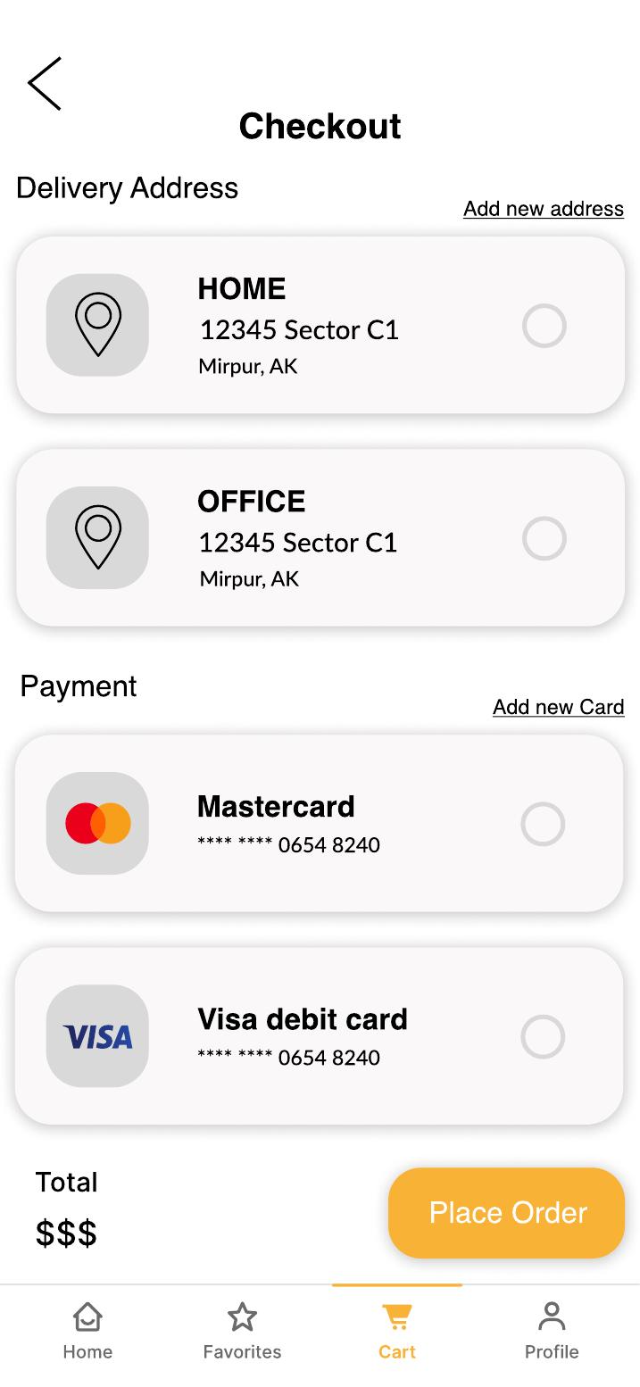
| Emotion | 😊 Happy Won't queue or call | 😤 Annoyed No search bar | 😞 Frustrated Can't save card | 😠 Anxious No rider tracking | 😄 Relieved Finally eating! |
| Opportunities | Google/Apple sign-in | Search barCategory tabs | One-page checkoutSaved payment | Real-time trackingNotifications | ETA displayReview system |
I audited three local competitors to understand the existing landscape and find where Smokin Grill could win.
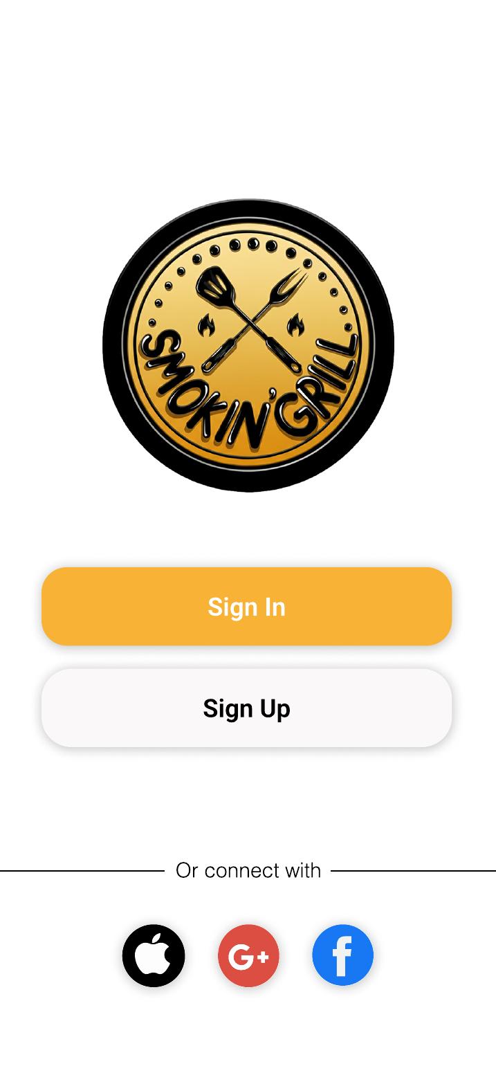
Before drawing a single screen, I mapped every route and decision point — making sure the structure matched how users naturally think about ordering food. The app has two entry states: unauthenticated (onboarding) and authenticated (the main experience).
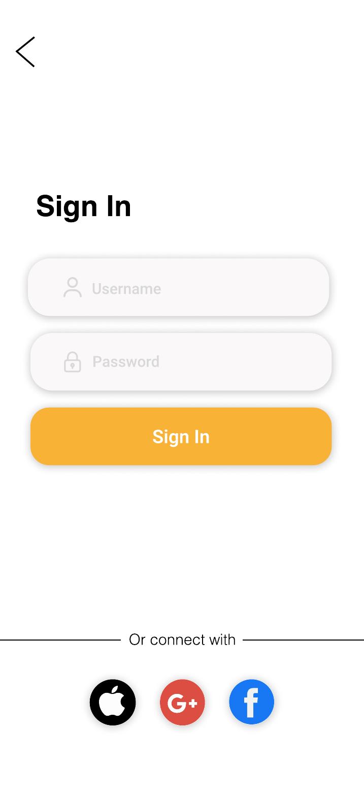
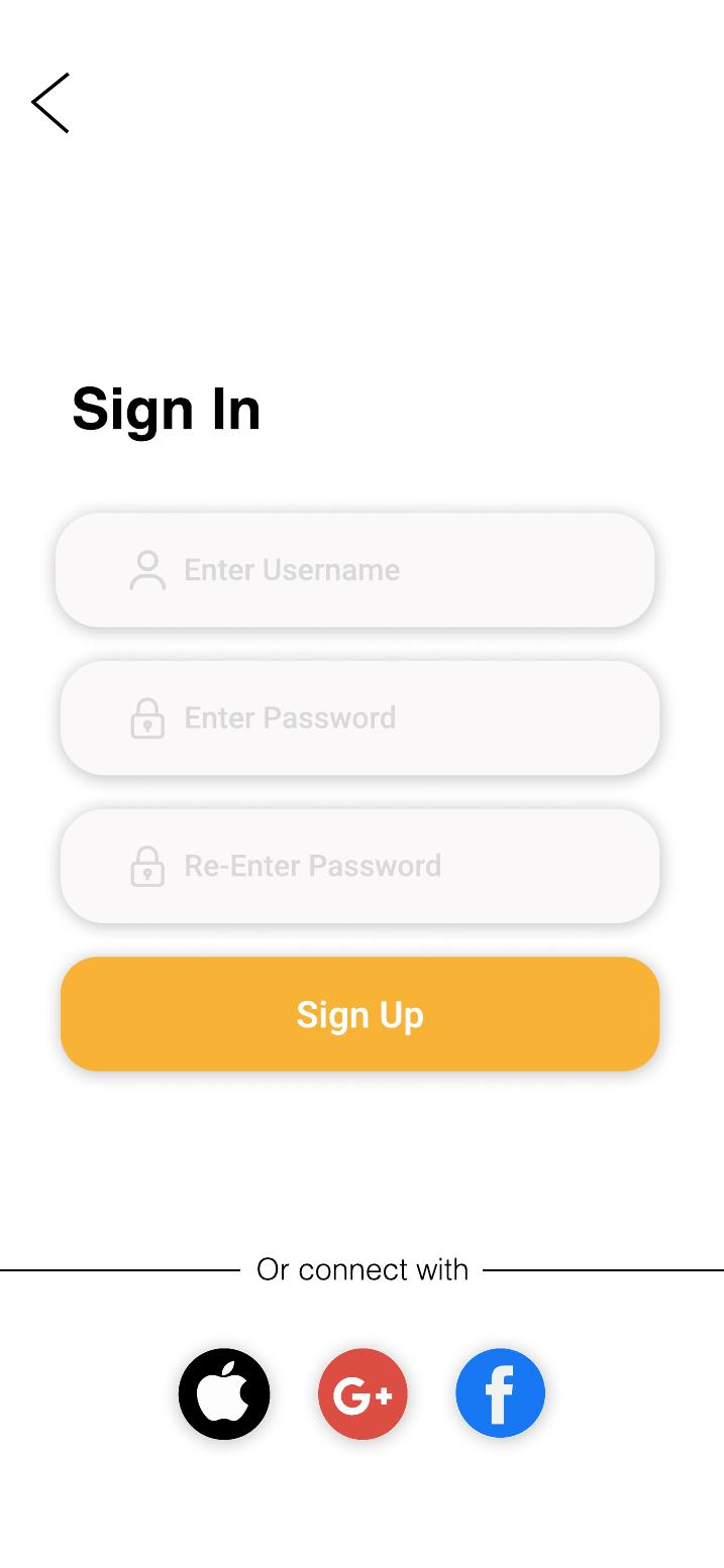
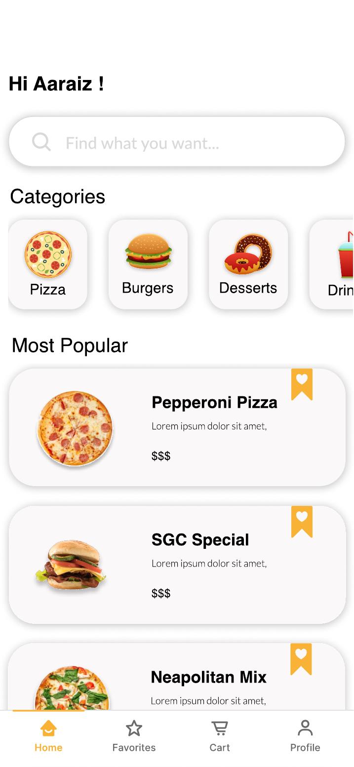
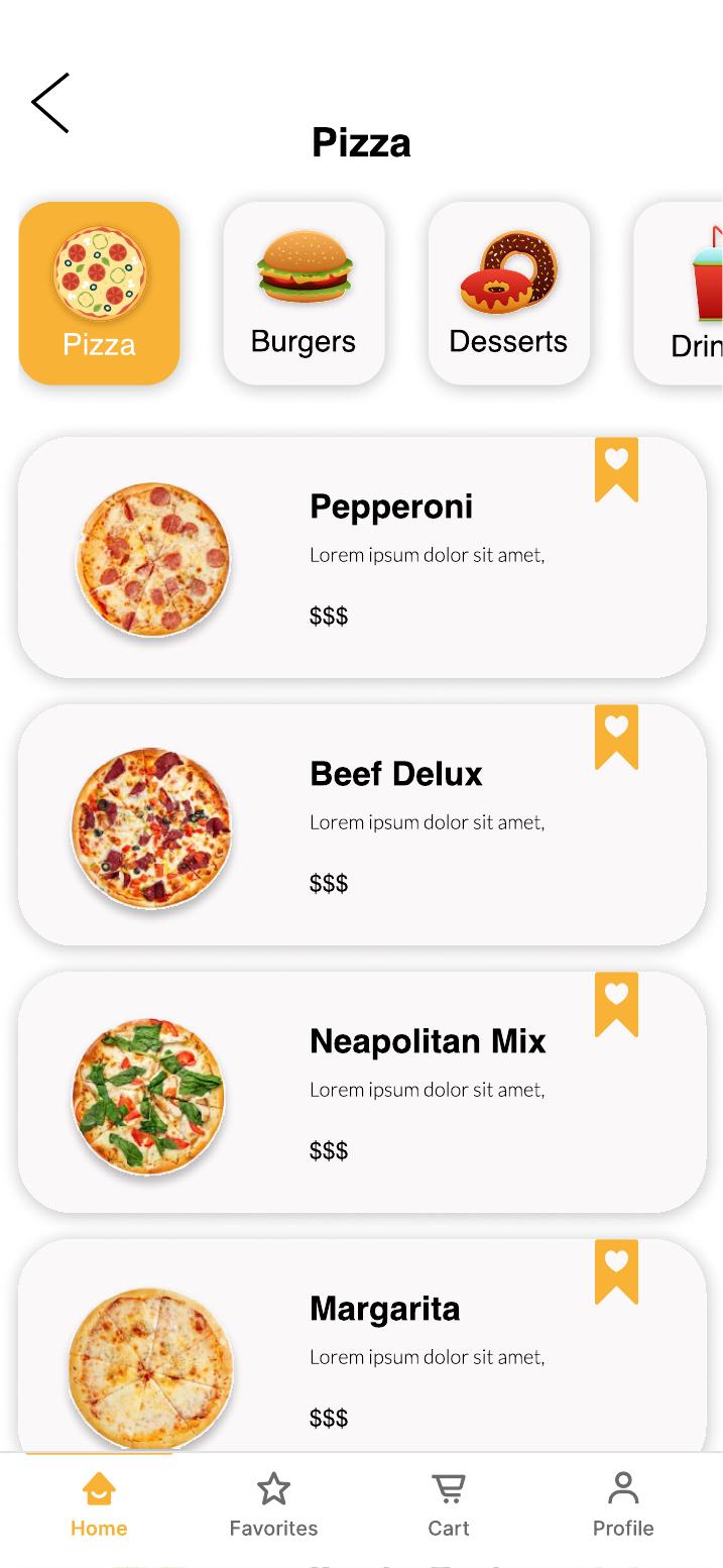
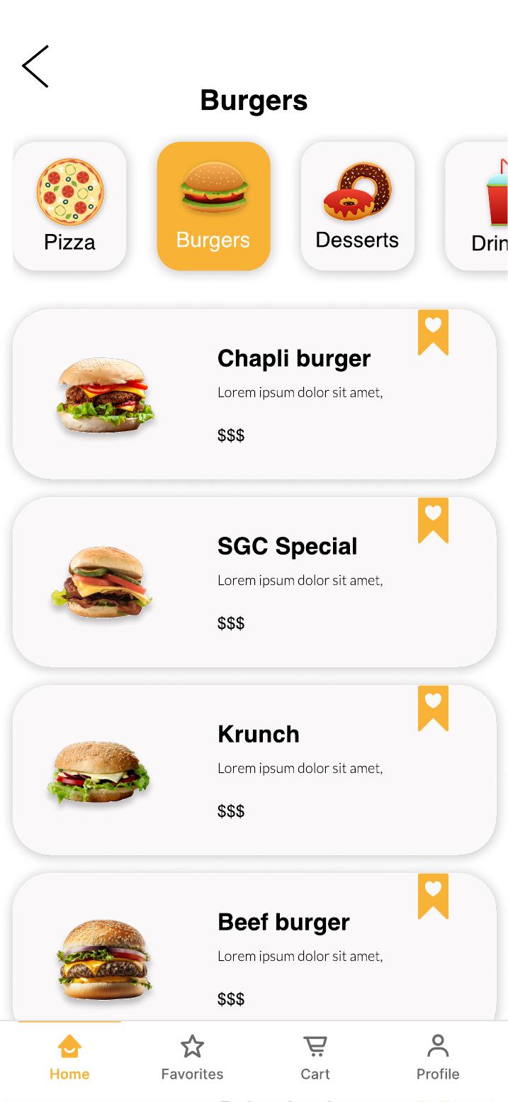
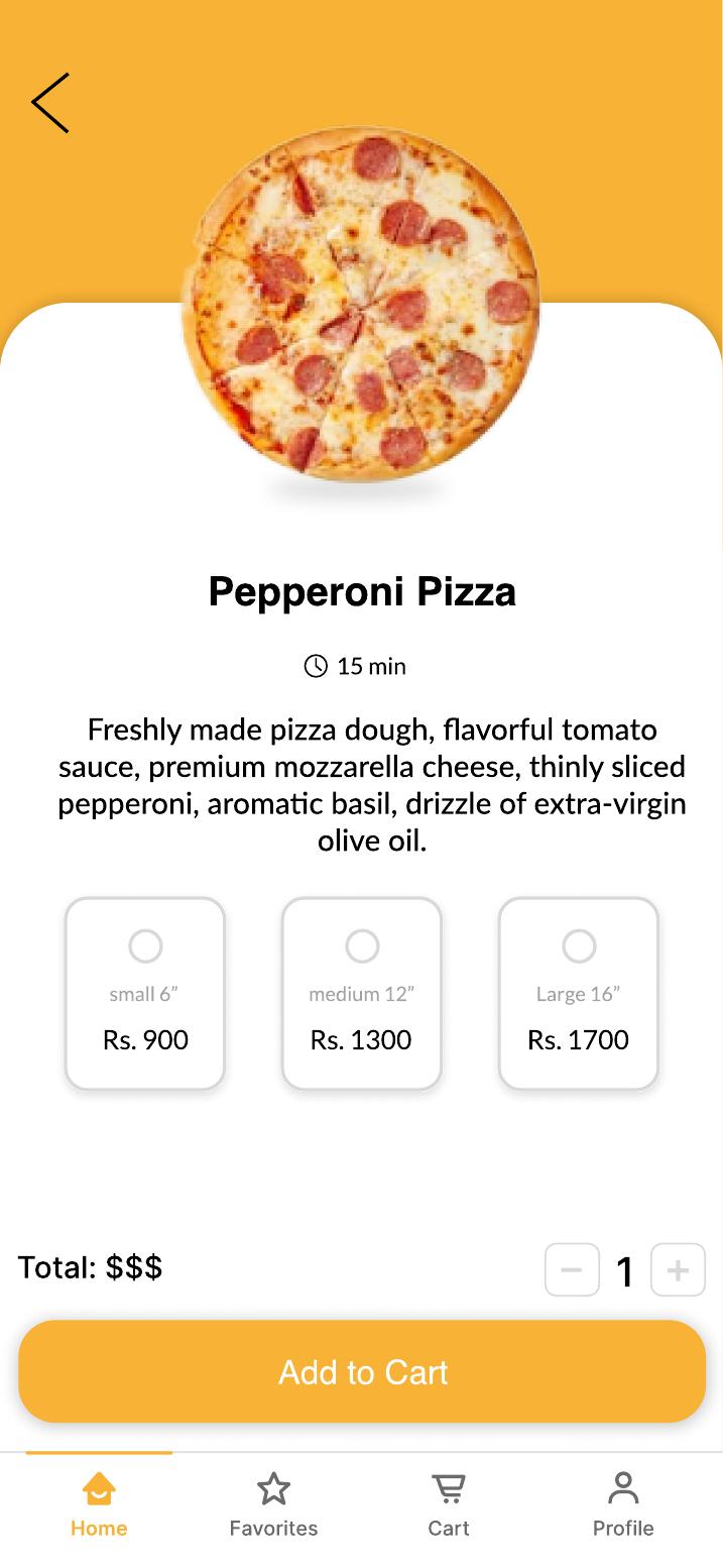
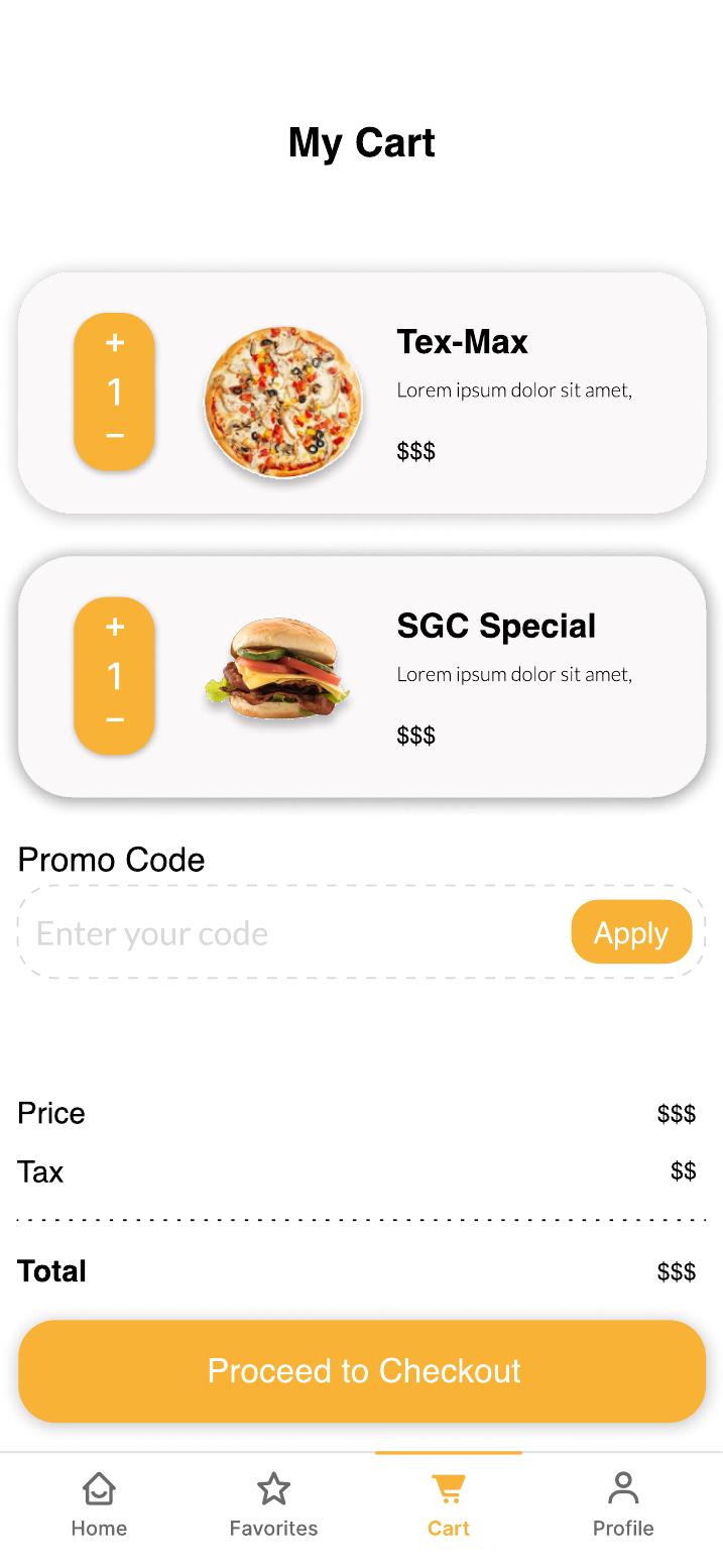
The auth gate is a one-time barrier — once past it, the bottom tab bar keeps every core action one tap away. The ordering flow (Home → Category → Item → Cart → Checkout) is linear by design to reduce decision fatigue.
I wireframed all 10 screens before opening the visual design file. Low-fidelity first meant I could validate the layout and flow with the client without getting distracted by colour or typography — and catch structural problems cheaply.
“Wireframing before visual design let me test the structure with the client without either of us getting distracted by colour or imagery. Two structural changes — moving search above categories and adding a confirmation state — were caught here, not in the final UI.”
Every decision was traced back to a specific research finding. Here are the five principles I committed to before touching Figma.
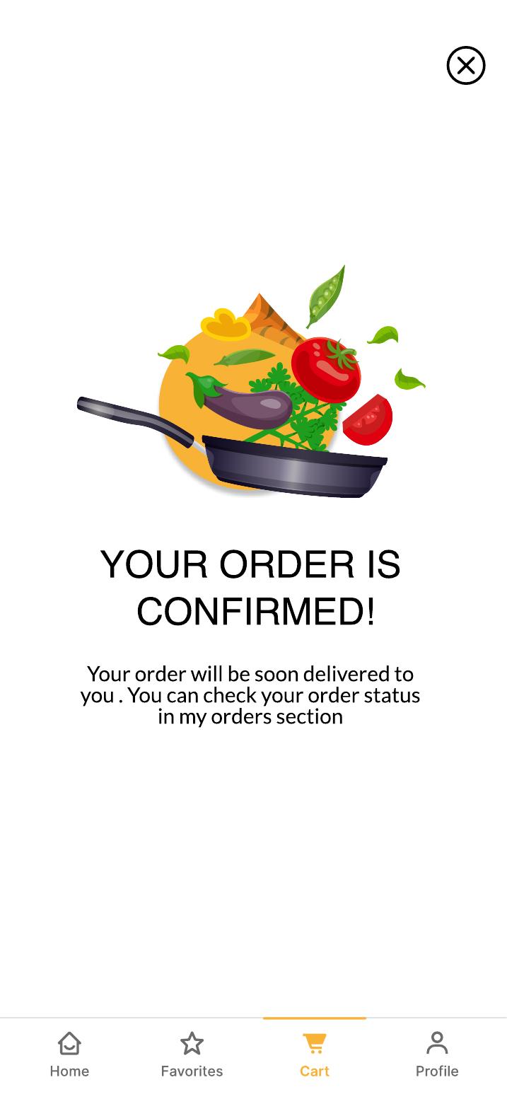
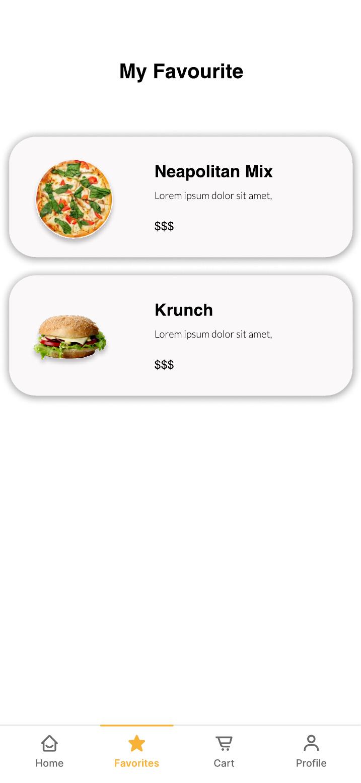
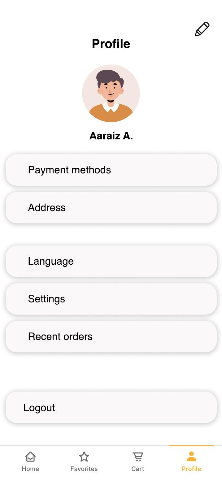
19 screens designed end-to-end in Figma — from splash screen through to order confirmation. Here are the key flows.